| |||||||||
|
'Sacralworm' is a term of a kind of driven snakelines/streamlines/waves with pseudo-3D-shading. Examples there, or a simple-, an average- or a mega-complicated ones. They aren't created with any tool (like aphosys(?), flaxframe (?) or such stuff), but they are handmade. Following I will describe the creation of a typical 'sacralworm'-graphic. You need Additional/optional: PS: I use Photoshop and can only explain for Photoshop - but I think, in any other professional software must be equivalents tools, filters and methods. Also I only have the german version, but I think also, the menues, buttons, checkboxes, sliders etc. are at the same locations in any other language. |
|||||||||
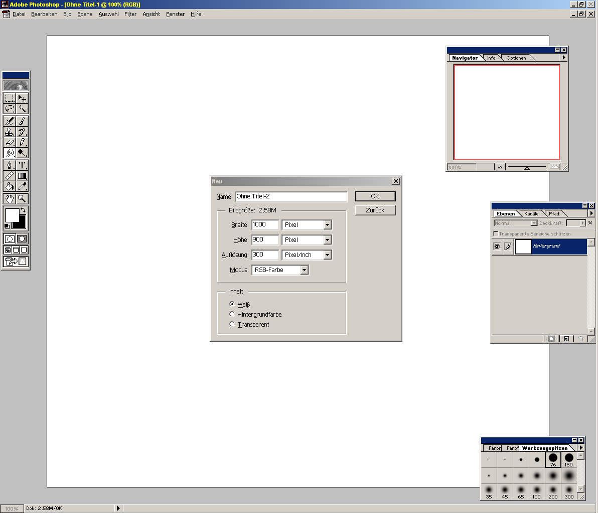 |
1) Create a new document in RGB-mode. Best nearly screen-filling size, e.g 1000x900. |
||||||||
 |
Background: 2a) Fill the background. In the example I've drawed quickly some radial gradients in 'difference' blending mode and b/w. Naturally you can use any other color, or e.g. the 'cloud rendering'-filter or any other kind of graphic you like - at last with some essential contrast between two or more colors 2b) Duplicate the background-layer to L2. Select L2 |
||||||||
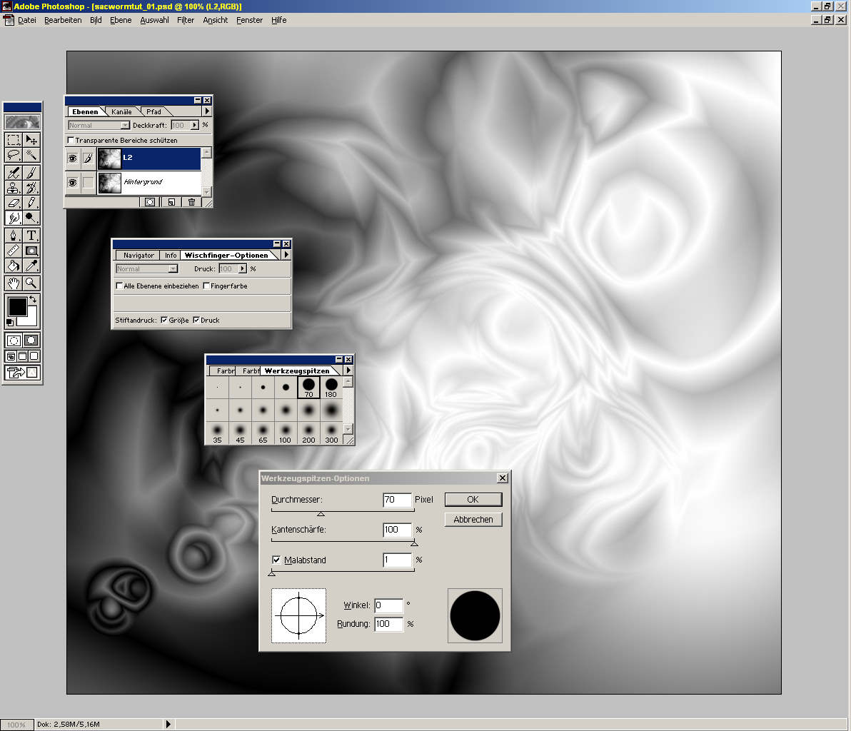 |
Smudge pencil: 3a) Doubleclick the smudge tool For the first try set options to the shown values 3b) Doubleclick an hard-edged pencil For the first try set the pencil options to the shown values. (For weak PCs the pencil radius should be less than 40pix) |
||||||||
 |
Drawing: Close pencil options und press <Tab>-key to hide all tools 4a) Positionate the pen at any point - best where two colors merge into one another. 4b) Stir a little a this point (to mix & blur the taken color - like a real pencil on a real palette.) 4c) And then... in one stroke draw a wavy line. |
||||||||
 |
4d) Repeat 4a-4c how often you like. And before overfilling the pic...! ;-) Experiment with pencil radius, pen pressure and the other options from 3) |
||||||||
|
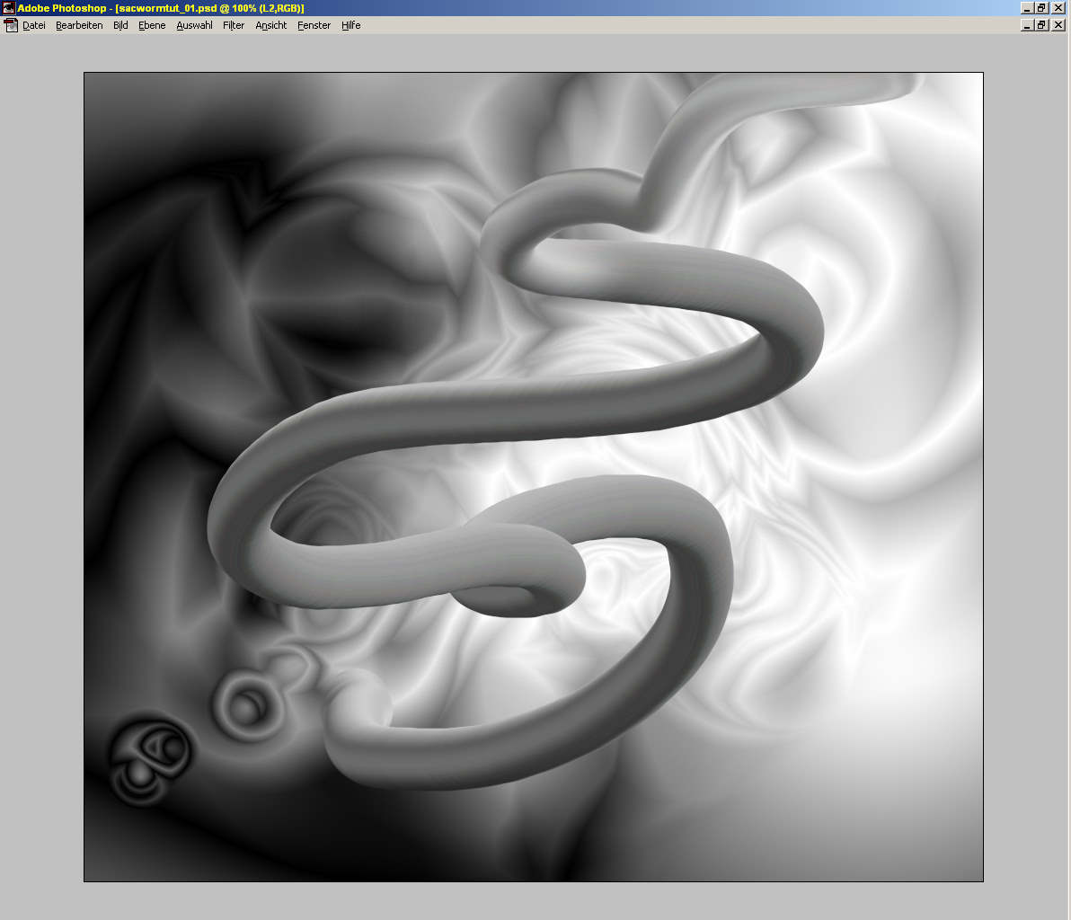
If you are satified with this simple version, you can stop here... But you get more: |
|||||||||
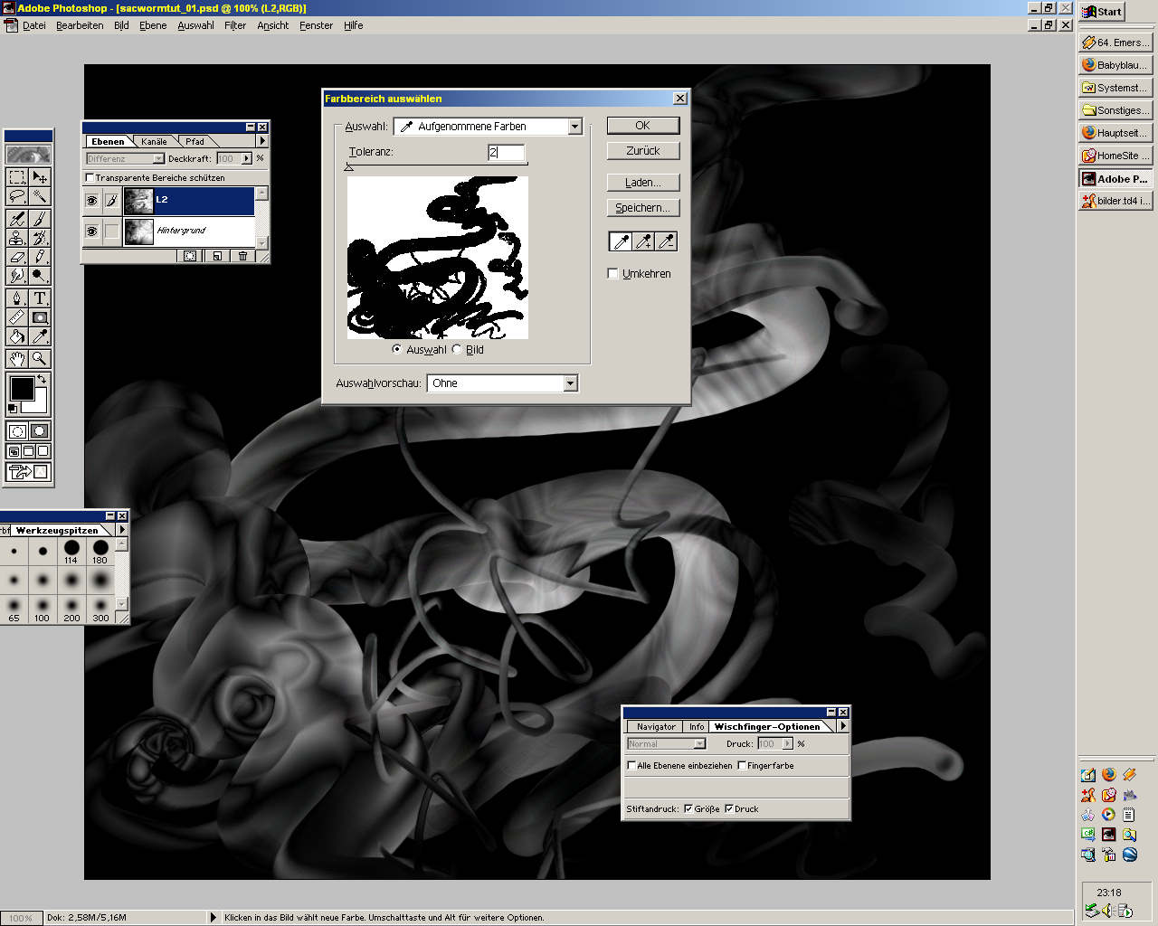 |
Cropping: 5a) Press <Tab>-key for toggle on the tool-windows. 5b) Select Layer L2. Set blending mode of L2 to 'difference' 5c) Start Select->Color Range. Mark a point of the black area outside the lines. Set tolerance max. to 2%. Press Ok. 5e) Now the parts of the original background are masked with an dotted line 5f) Press <Del> for cropping the lines |
||||||||
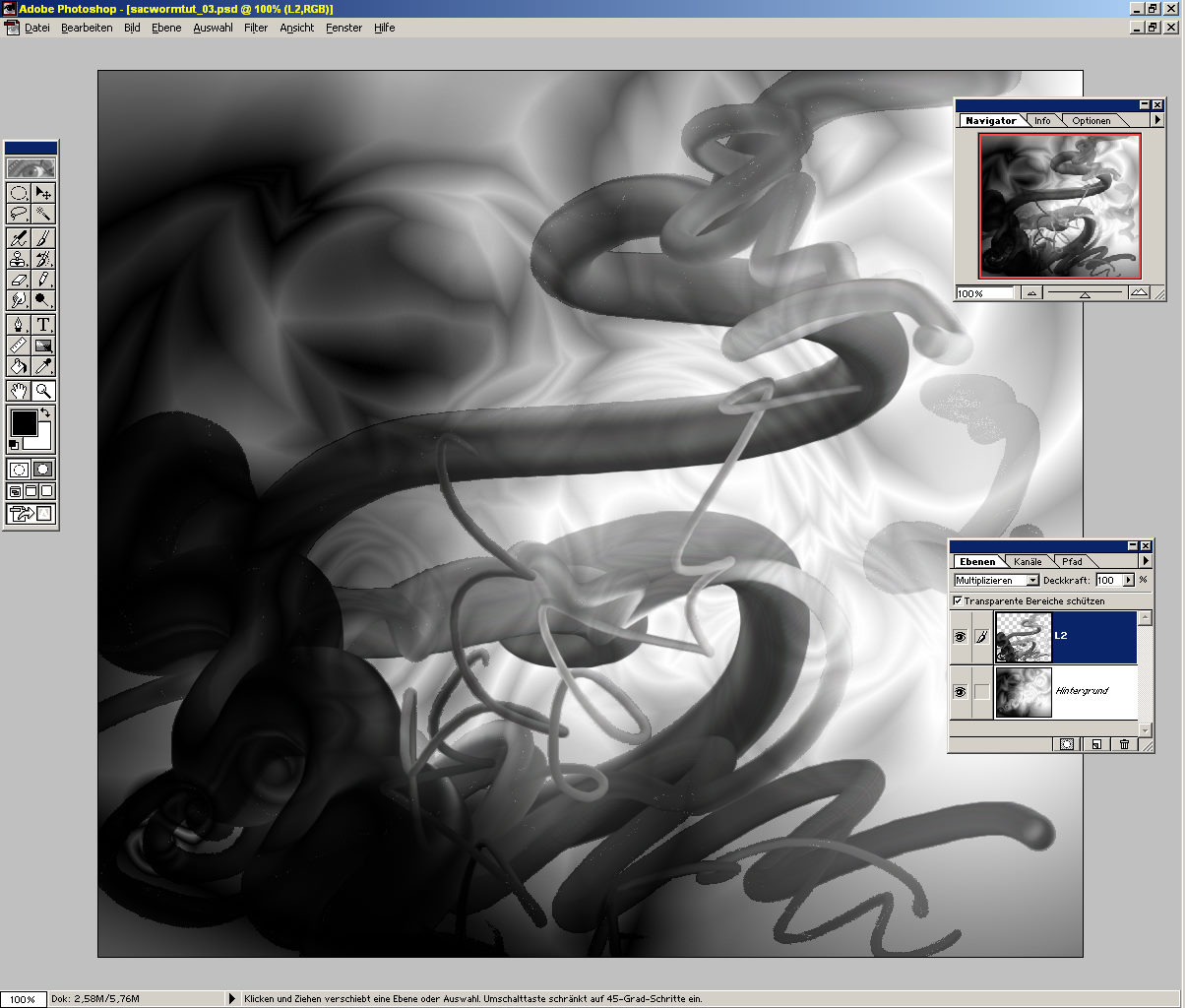 |
Blending: 6) Experiment with blending mode of L2 and ocapity. Try each from 'normal' to 'luminosity'. At the example I've chosen 'multiply' 100% |
||||||||
 |
Edges: 7a) Duplicate Layer to L3. Select L3. Set blending mode to 'normal'. 7b) Apply Filter->Stylize->Find edges |
||||||||
 |
Blending edges: 7c) Experiment with blending mode of L3. Try each from 'normal' to 'luminosity'. At the example I've chosen blending mode 'multiply' 100% Merge: If you are satisfied with an intermediate result, you can merge same layers: 8a) Toggle off the background-layer (klick on the eye-symbol on layer-palette) 8b) Layer->Merge Visible 8c) Toggle on again the background-layer. Set blending mode of L2 again to 'multiply' |
||||||||
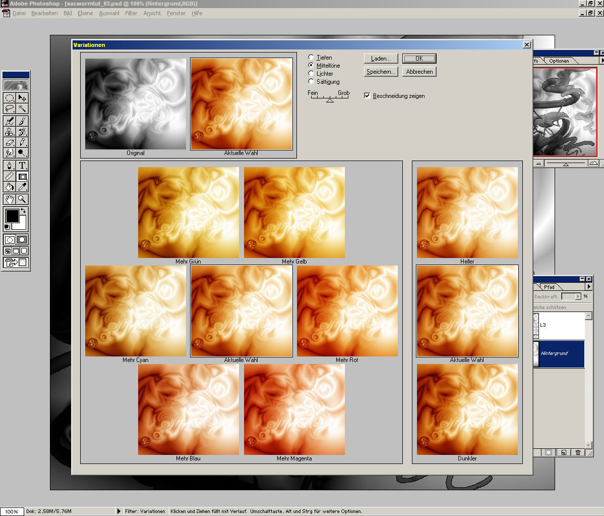 |
Adjust background-colors: 9a) Select background-layer 9b) Start Image->Adjust->Variations. Mix a background color. At the example I've chosen a warm orange tone. Press OK. |
||||||||
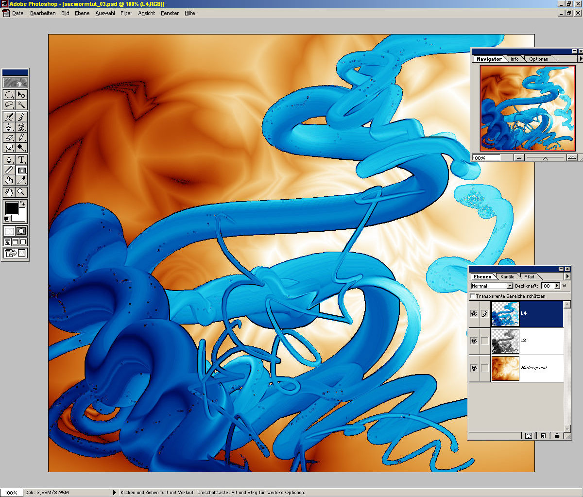 |
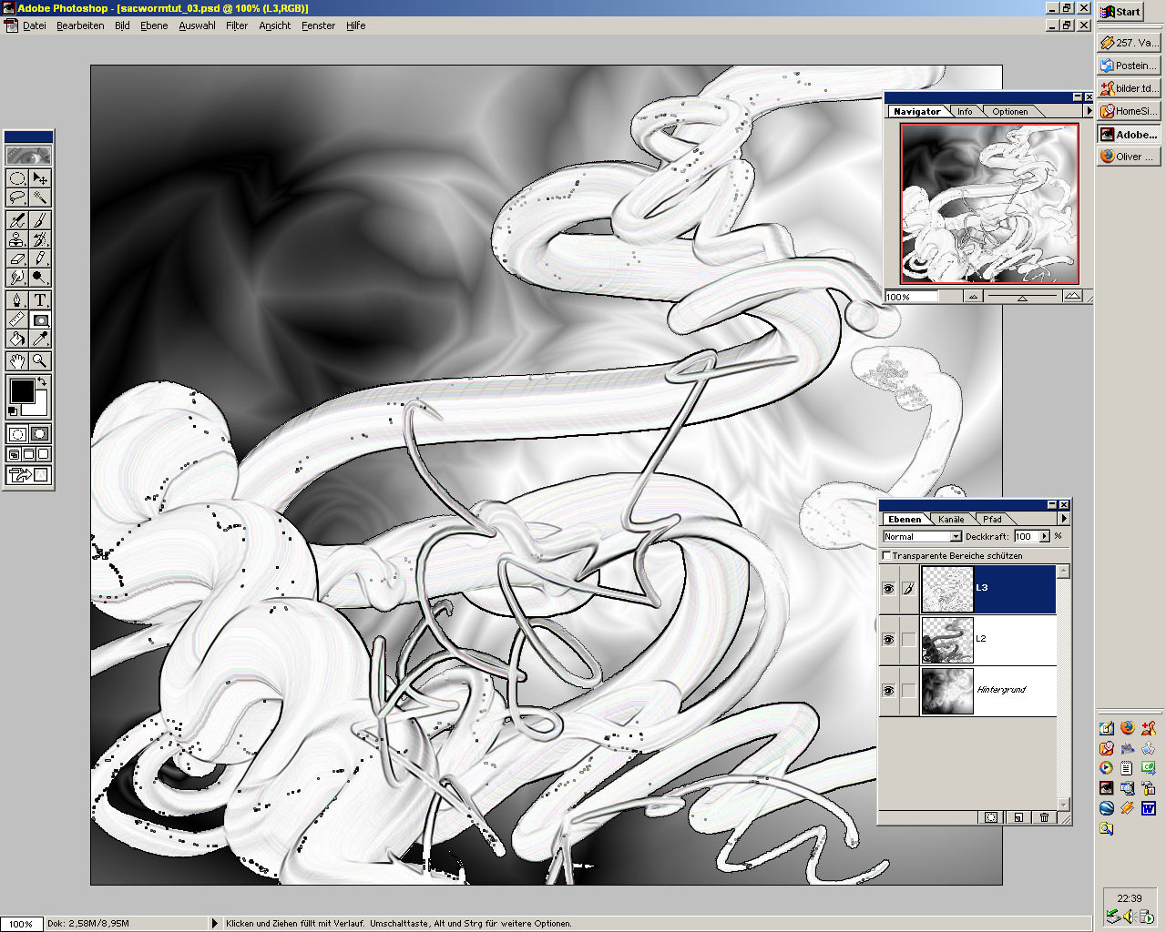
Adjust line-colors: 10a) Duplicate L3 to L4. Select L4. Toggle of L3. (L3 and all layer-duplication are reserved for undo, or as pattern for later layer-variations etc) 10b) Start Image->Adjust->Variations. Mix a color. At the example I've chosen a cold blue tone. Press ok. 10c) Experiment with blendig mode of L3 and ocapity. Try each from 'normal' to 'luminosity'. At the example I've chosen 'normal' 100% |
||||||||
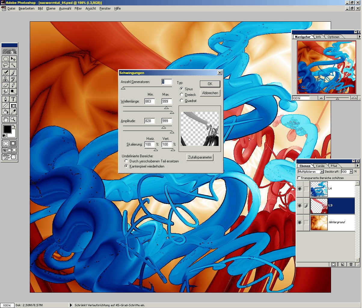 |
Wave: 11a) Select L3. Start Filters->Disort->Wave. Set options to the shown values. (Not exactly, but experiment). 11c) Press 'random parameters' until an interesting disortion displayed in the preview. Press ok. 11d) Start Image->Adjust->Variations. Mix a color for the shaken line. At the example I've chosen a red tone. 12) Merge all layers to background: Layer->Merge Visible |
||||||||
|
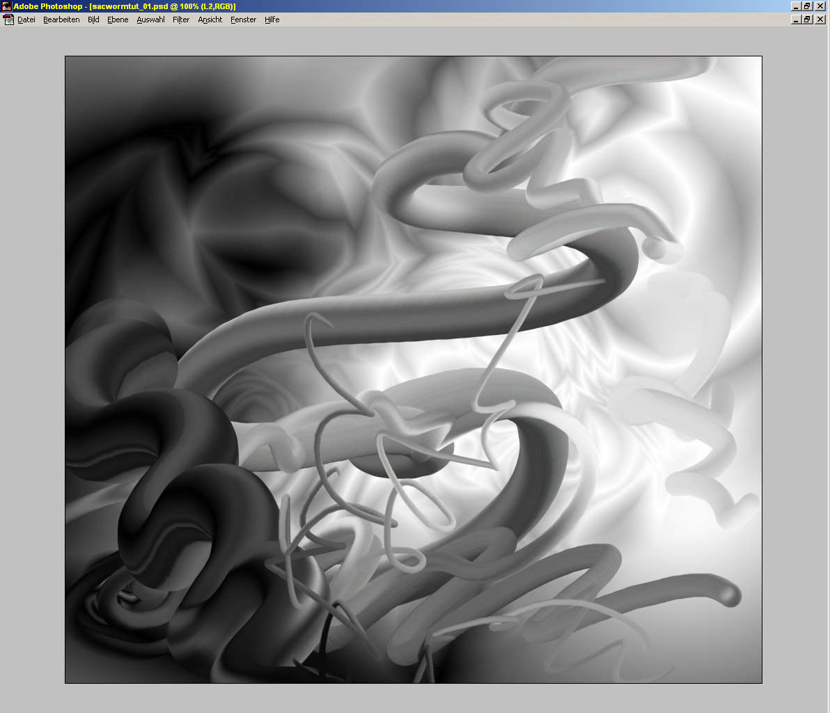
If you are satified with this simple version, you can stop here... But now the final tuning: |
|||||||||
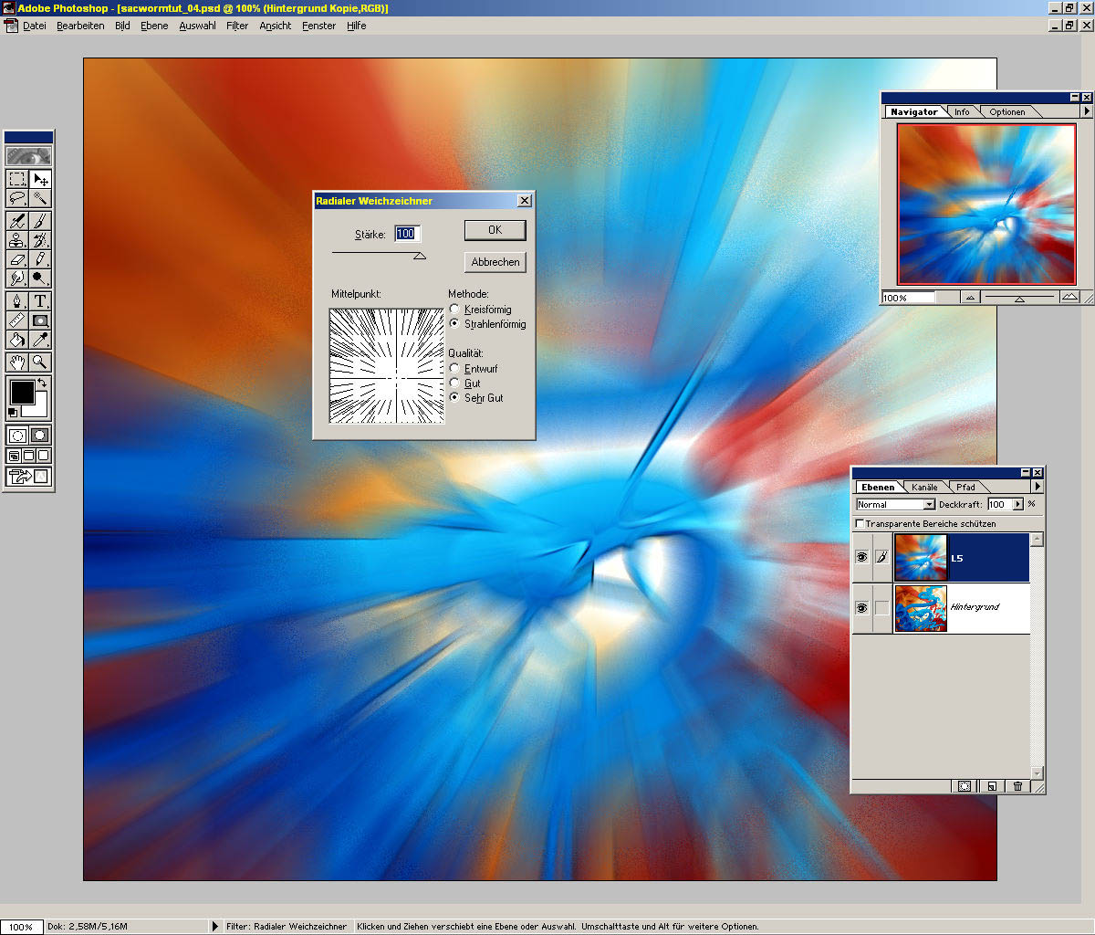 |
Radial blur: 13a) Duplicate background-layer to L5. Select L5 13b) Filter->Blur->Radial Blur. Set options to the shown values. (Not exactly...experiment) For best effect the radial center best positioned near a contrasted edge. Press OK. |
||||||||
 |
13c)Experiment with mode of L3 and ocapity. Try each from 'normal' to 'luminosity'. 13d) If there no interesting effect, or all too dark, too unbalanced etc: delete layer, and try 13a-13c again. At the example I've chosen 'multiply' 77% 14) Layer->merge visible |
||||||||
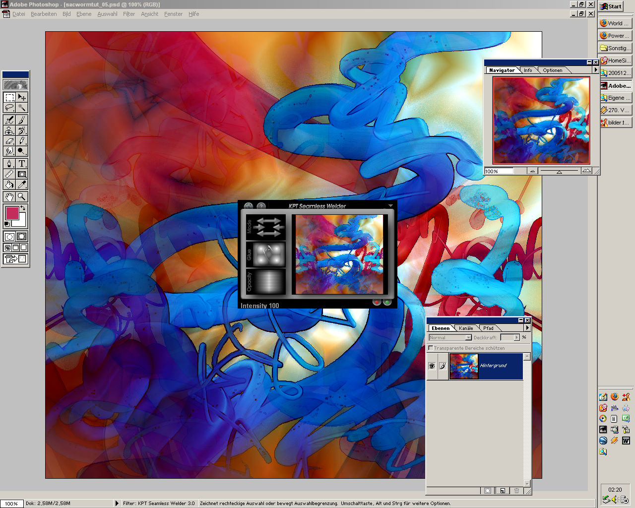 |
Border reflection:(for owner of Kai Power Tools only) 15) Start Filter->KPT Seamless welder Experiment with glue and ocapity mode from 'normal' to 'screen'. At the example I've chosen 'normal' 100% |
||||||||
 |
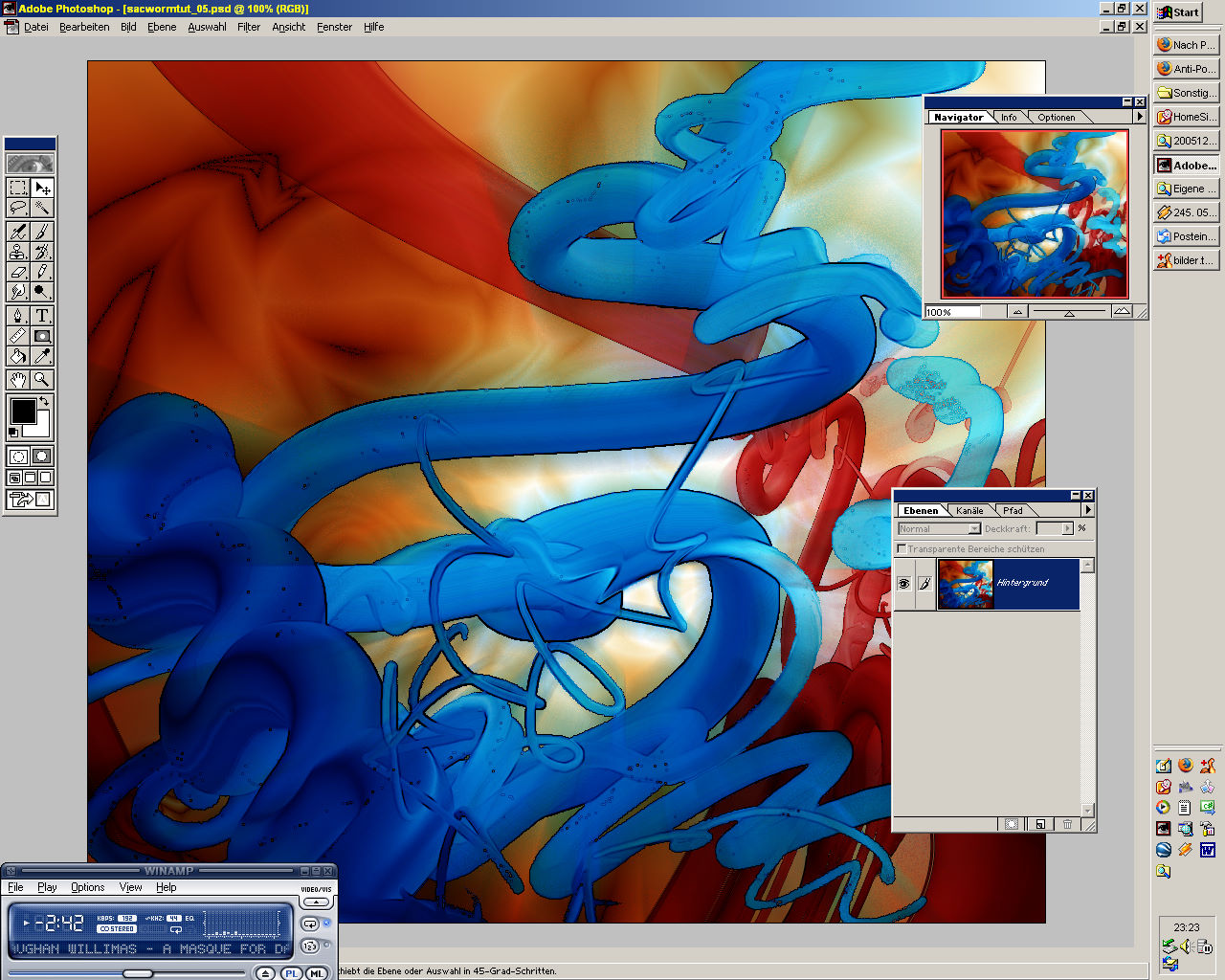
16) Ready,... | ||||||||
|
... no, not ready!;-) These are only basic operations for only one pass. Experiment with options, (mostly blending modes after a variated layer), with filters, pens etc. For more complicated pics you take your last state from 16) as background and start again with 2b): duplicate, overdraw/vary, experiment, blend, duplicate, overdraw/vary, experiment, blend ....etc ;-) For questions, suggestions and abuse mail here. © by Ingo H., Jan. 20005 |
|||||||||